Principles of Art - Understanding the Principles of Design
- Why Are All the Elements of Art Important?
- The Visual Weight of Elements
- What are the Main Principles of Art?
- Balance: Asymmetrical balance, Break the Symmetry
- Contrast and Emphasis
- Movement and Rhythm
- Variety
- Unity and Harmony
- Pattern and Repetition
- Proportion
- Scale
- Composition and the Principles of Art
- The Seven Elements of Art
- Value
- Line
- Form
- Shape
- Space
- Texture
Ever wondered what a painting is made of? Looking at something like the Renaissance's Mona Lisa or some recent work by Claude Monet, you see an assemblage of all kinds of artistic pieces.
Ideas and shapes are the building blocks of art. They allow artists to create their pictures and tell a story. They use these building blocks to depict what they want to express through art and shape their craft as they wish.
This guide takes you through these principles of art and how artists use them to develop their iconic works.
Why Are All the Elements of Art Important?
The foundations of art rest upon the elements that are their fundamental building blocks. When you skillfully grasp and use these elements, your artwork becomes more harmonious and meticulously crafted.
There are seven core elements of art, each with its unique capabilities:
- line,
- shape,
- form,
- value,
- color,
- space,
- And texture.
Each of these visual tools can add something unique to your artwork. Think about lines; by changing their thickness or the way they go, you can make your art look different.
Shapes can make your art seem like it has depth or looks 3D. And when you mix and match colors just the right way, your artwork can express all sorts of feelings and vibes.
Stay tuned as we'll take a closer look at each of these elements, one by one, later on this blog.
The Visual Weight of Elements
Think of art elements as having their own 'visual weight,' similar to gravity. Visual weight determines what catches the viewer's eye, making certain elements stand out more than others.
For instance, bold and bright colors draw much attention, while muted and softer colors have less visual impact. Rough or textured surfaces grab your eyes more than smooth ones. Complex shapes are fascinating, while simple shapes are less attention-grabbing. Dark colors have a stronger pull on our eyes than light colors.
In Caspar David Friedrich's painting, a large, dark figure is visually dominant. This makes it stand out prominently, distinguishing it from the lighter, smaller rocks in the background. As a result, the viewer's focus is naturally drawn to the figure, making it the central point of interest in the painting.
Understanding how to leverage these characteristics of elements to emphasize certain aspects helps create art that adheres to the principles of visual weight, guiding the viewer's eye to the intended focal point.
What are the Main Principles of Art?
As per the trusty Merriam-Webster Online Dictionary, the term "principle" is like the backbone of a concept, meaning it's a primary, critical law, idea, or even a rule to follow.
So, when we talk about principles, we're digging into the primary and most vital rules or concepts that steer something. Before we explore art principles, it's crucial to distinguish them from art elements.
Elements serve as the building blocks for art, while principles function as the governing rules. They play a vital role in art evaluation and comprehension.
When diving into the art world through reading and research, always remember the distinctions and roles of these terms in visual art. We aim to clarify differences while using them interchangeably when necessary.
Art principles guide artists as they craft their paintings, drawings, and sculptures. There's a whole list of them, and they work together like a team.
These principles include:
- balance
- contrast and emphasis
- movement and rhythm
- variety
- unity and harmony
- pattern and repetition
- proportion
- scale
Artists skillfully blend these principles to craft beautiful, harmonious creations that catch the viewer's attention and inspire them.
Balance: Asymmetrical balance, Break the Symmetry
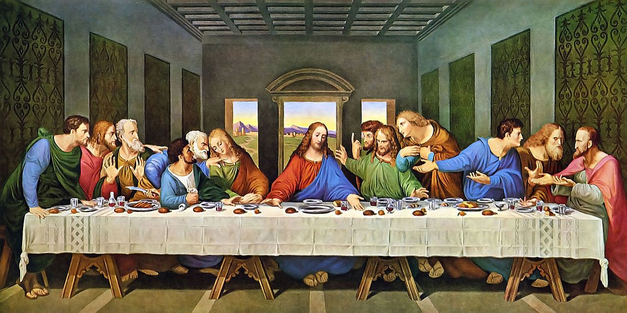
The Last Supper (1495 – 1498) By Leonardo Da Vinci, Located In The Santa Maria Delle Grazie In Milan, Italy
Art balance evokes a feeling of stability and harmony. Artists achieve this by strategically placing elements with matching visual weight across the canvas.
They can do it in two ways: by putting things equally on both sides (that's symmetrical) or by making things different but still feel and achieving balance (that's asymmetrical).
Symmetrical is where two sides are equal, like a mirror image. An asymmetrical balance is where there may be non-matching sides, yet it still feels like the image is in harmony.
In a nutshell, art balance means striking the perfect balance.
Contrast and Emphasis
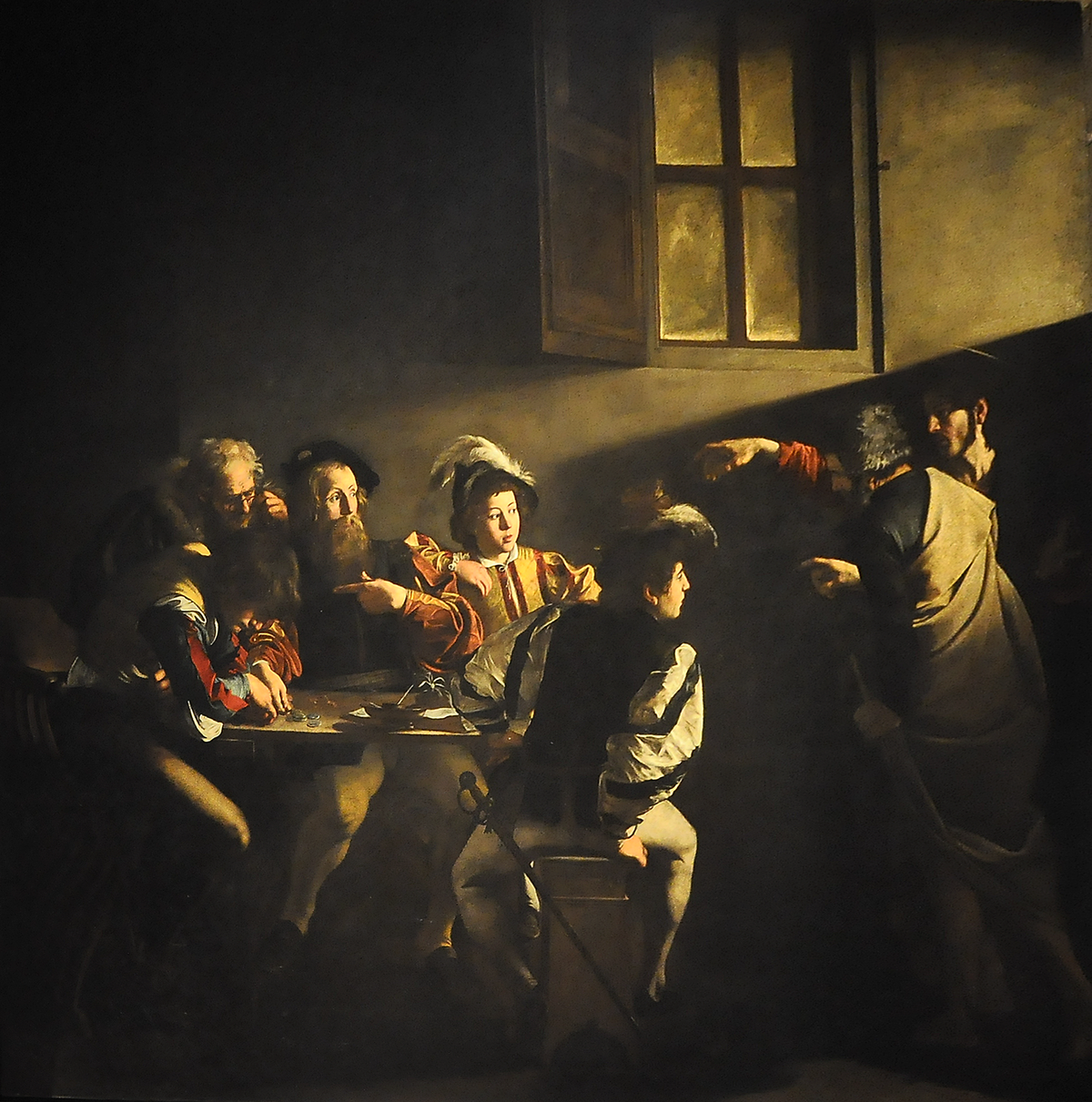
The Calling Of Saint Matthew (1599 – 1600) By Caravaggio, Located In Contarelli Chapel In Rome, Italy
Think of contrast in art as arranging things differently than they are supposed to be in a picture, such as using different colors, spaces, shapes, and so on. The clever use of contrast helps to put the viewer’s attention to the central subject.
It gives an additional touch to the central point of the picture. In so doing, you will be able to highlight more on one part. For a real-life example of contrast, you can take a look at “Notan.”
Movement and Rhythm
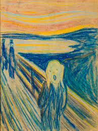
"The Scream" (1893) By Edvard Munch
Art movements are a visual journey for your eyes. It directs your eyesight to the central point or causes you “to look around” in the picture. So, you arrange and use different elements to create a feeling of action.
Lines are perhaps the main elements that can give movement to an image; it is usually not vertical or horizontal lines— instead, they’re diagonal. They also make the art come alive with other elements such as color, space, and shape.
On the other hand, rhythm relies on the same element being repeated (uniform repetition) or ordered in some specific way, which looks like a dance routine. This visual tempo together makes an artwork a lively experience.
Variety
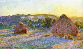
Stacks Of Wheat (End Of Summer) (Between 1891 And 1897) By Claude Monet, Located In The Art Institute Of Chicago In Chicago, United States
Variety in art is what makes a composition special and unique. As the name suggests, it's a mix of colors in a beautiful painting.
Think of it as a dance of color contrast. Sometimes, it can be an image of organized "chaos." These themes can keep the viewers interested and amazed. Organized "chaos" and contrasting elements command the art alive and tell its own story.
Quick Note: A well-balanced use of variety is important. The idea is to avoid overdoing it, making the composition lose its beauty or the story unclear. However, relying on too much unity may induce monotony or an unclear message.
Unity and Harmony
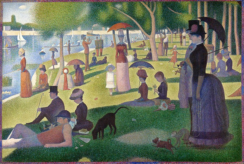
A Sunday Afternoon On The Island Of La Grande Jatte (Between 1884 And 1886) By Georges Seurat, Located In The Art Institute Of Chicago In Chicago, United States
Despite the similarity of this principle with Balance, their meaning slightly differs. Understanding Unity and Harmony can be a bit tricky because they can be perceived in both similar and distinct ways.
The key difference in these terms is that Harmony refers to how different elements function together, possibly bringing about rhythm or repeated art elements. This differs from Variety, which sometimes appears to be chaotic. The sense of harmony gives a calm spirit and the continuity effect, bringing peace to that artwork.
On the other hand, unity creates monotony and addresses how all the components of an artwork fit together. This means that, similar to unity, many elements within each piece should work together so that it doesn't feel like separate elements.
Pattern and Repetition
These classic patterns are arranged into repetitive sequences of elements such as lines, colors, shapes, etc. Compositions can also have different effects if pattern types are repeated nonuniformly or uniformly. This can create movement, texture, unity, or balance.
Proportion
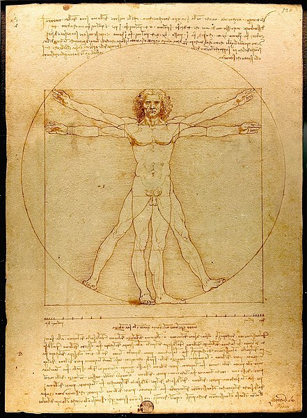
Vitruvian Man (C. 1492) By Leonardo Da Vinci, Located In The Gallerie Dell’ Accademia In Venice, Italy
Proportion refers to how the various parts of an object in a composition relate to one another in size and shape. Imagine you're painting a portrait featuring both a dog and a person. The person's and the dog's bodies should be the right size, as we know a human should look. Therefore, scale and proportion make the viewer relate to the artwork better. We'll explain what scale means in more detail in the next part.
Scale
In principles of art, it's essential not to mix "scale" with "proportion." Scale is about the size of an object within the composition compared to all the other things.
For instance, if a person stands next to a building and it looks just like it would in real life —that's scale. Some art sources even mention it as "usually the size of the artwork compared to the viewer's body."
It's similar to making sure things in a picture are the right size, just like in real life.
Composition and the Principles of Art
An artwork's composition is how all the visual elements are combined. The principles of art come into play to build a successful composition.
Visual elements of art—like emphasis and contrast—pull the viewer's attention to specific parts, keeping them interested.
Meanwhile, principles of art like unity step in to create emphasis and ensure everything makes sense and has a nice, orderly feel. It's like telling a story in pictures, each art playing its part to keep the viewer's eye hooked.
The Seven Elements of Art
Now, let's start exploring the seven elements of art. Similar to the colors on an artist’s palette, these become the “visual tools” in a painting.
All elements of art add a unique sense that creates a composition similar to a free-flowing brushstroke, whether one that dives into a bold and directional brushwork or just an ordinary one. It’s like mixing and combining colors to achieve a fantastic piece of art.
Color
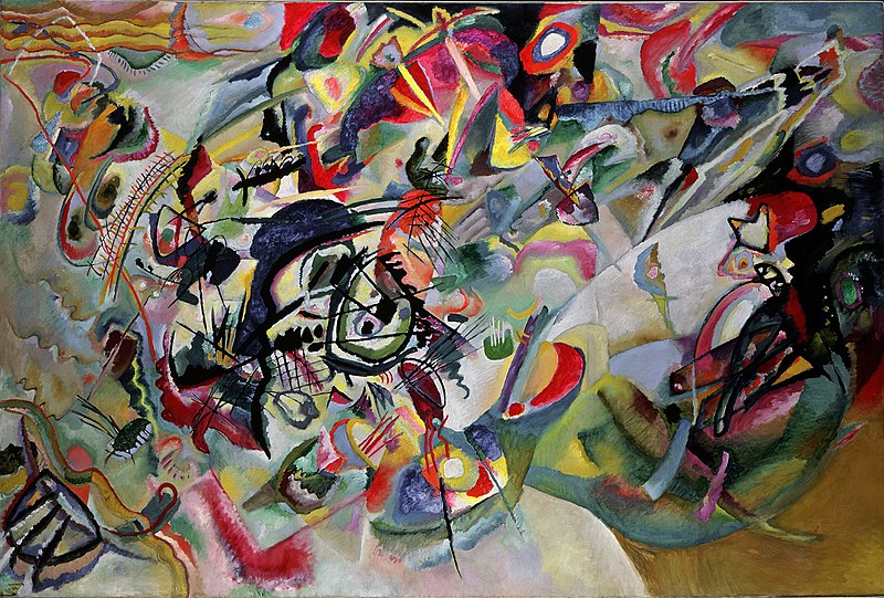
Composition Vii (1913) By Wassily Kandinsky, Located In The Tretyakov Gallery In Moscow, Russia
Color plays a critical role in visual arts, and its effects extend beyond the visual aspect. It crosses into the domain of psychology and science.
Artistic gurus such as Wassily Kandinsky and Piet Mondrian have given visual examples of celebrating color in artistic works. Color opens a tremendous spectrum of opportunities.
To begin with, let us break down the interaction of color and light as a foundation for understanding how colors are combined in various works of art.
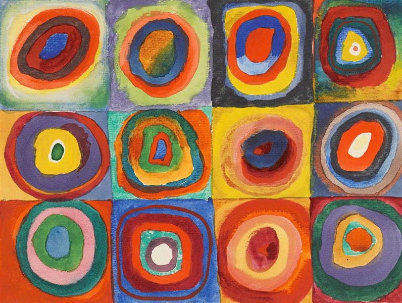
Color Study: Squares With Concentric Circles (1913) By Wassily Kandinsky, Located In The Stadtische Galerie In Munich, Germany
Colors reach our eyes through reflected light as it dances off the objects surrounding us. It resembles a mesmerizing play of light and hues that bring art to life.
Color can be broken down into three fundamental elements:
- Hue
- Value
- Intensity (also described as saturation or chroma).
Hue signifies a color's intrinsic character, for instance, blue, green, or purple.
Another major concept of colors is the "Color Wheel." It comprises primary (red, blue, and yellow), secondary (purple, orange, and green), and tertiary colors.
However, it should be noted that tertiary colors are subject to some debate. Some sources refer to them as secondary complementary colors. On the other hand, others categorize them as intermediate or complementary colors produced by the mixture of primary and secondary colors as exhibited in a color wheel.
Value
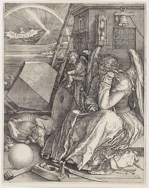
Melencolia I (1514) By Albrecht Dürer, Located In The Minneapolis Institute Of Art In Minneapolis, United States
The element of value refers to the lightness or darkness of a color and encompasses the entire spectrum, from white’s brilliance to black's depth.
A color with white added to it becomes a tint, and the value gets lighter. However, when black is added to another color, it becomes a shade and works towards the value contrast.
Intensity, in comparison, refers to how bright or dull the color is. The main difference is its effect on the vibrancy of a color.
It is noted that as the value of a color becomes lighter, its intensity diminishes and vice versa.
Line
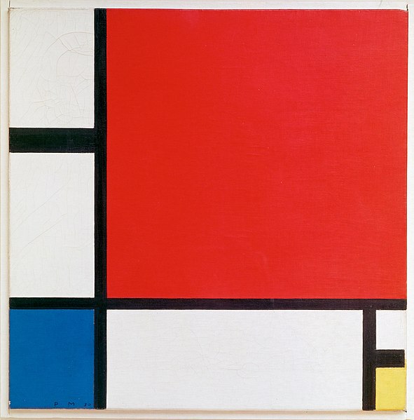
Composition Ii In Red, Blue, And Yellow (1930) By Piet Mondrian, Located In The Kunsthaus Zürich In Zürich, Switzerland
A line is an essential building block of visual art, and it can be defined as a mark that spans between two points. The lines vary from vertical and horizontal to diagonal ones.
Lines can exhibit a multitude of characteristics — thick, thin, curvy lines, straight, short, long, or have a unique pattern, each contributing distinct effects to a composition. Lines play a very important role in creating movement, depth, shading, and perspective, and they also help emphasize shapes or ‘contours.’
These elements of art become evident from the Expressionist art movement artists and why such artists preferred to use bold, dark outlines.
Artists such as Edvard Munch and Vincent van Gogh are famous for their skillful deployment of these expressive lines.
Form
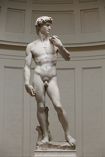
David (1501 – 1504) By Michelangelo, Located In The Galleria Dell’ Accademia In Florence, Italy
Form in art refers to the object's three-dimensionality, an object expressed through volume involving width, height, and depth. Forms can also take place through other elements of art, like different colors and lines that characterize contours or outlines.
This type of art comes in diverse forms, mostly organic and geometric. Nature often inspires organic forms and takes on more irregular and asymmetrical shapes.
On the contrary, geometric forms are " mathematical " represented in cylindrical, cubic quadrangular cone–like figures, pyramids, and spherical bodies.
Shape
Though closely related to form, shape is two-dimensional. This surface is often called "flat" since it possesses only length and width, unlike form, which features three dimensions. This may introduce geometric/organic shapes as a parallel.
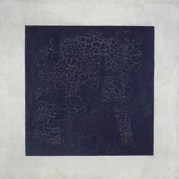
Black Square (1915) By Kazimir Malevich, Located In The Tretyakov Gallery In Moscow, Russia
Shapes come in various types, including
- circles,
- squares,
- triangles,
- rectangles,
- ovals, and more.
Shapes are interesting because they can be altered into forms. For example, a circle may become a sphere. A triangle may take on the form of a cone, the square might evolve into a cube, and so forth.
Space
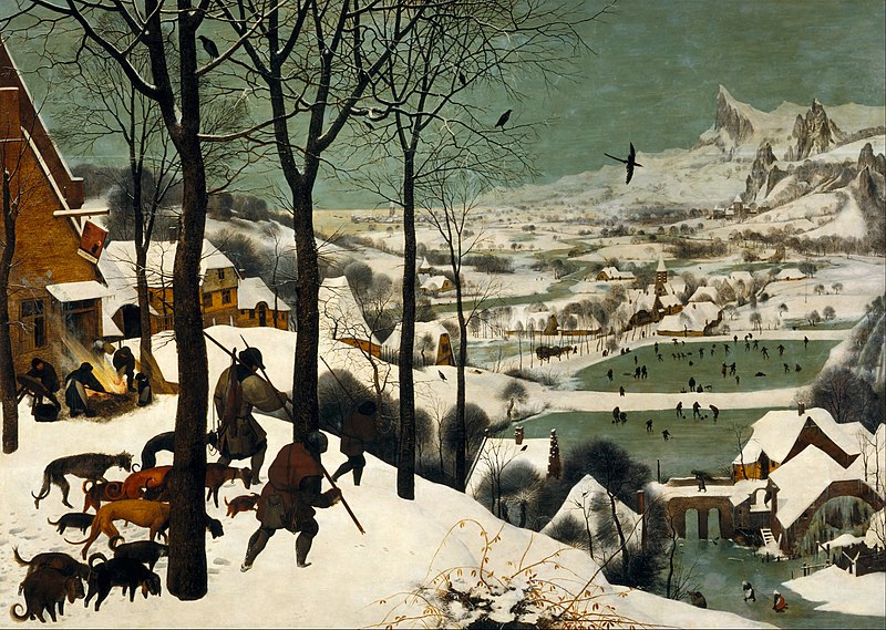
The Hunters In The Snow (1565) By Pieter Brueghel The Elder, Located In The Kunsthistorisches Museum In Vienna, Austria
Space is often defined as a void or a gap “within,” “through,” or "around" the canvas space. This space may be in the form of a canvas, sculpture, or another art form.
It's important to recognize various types of space, namely positive, negative, open, and closed.
The term positive space is used by art historians to refer to the focal point of the art piece itself—the flower in a successful painting or the sculpture structure. Negative space is when the artist creates hollow areas around, between, and inside the subjects.
Texture
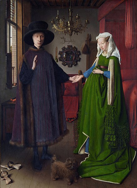
The Arnolfini Portrait (1434) By Jan Van Eyck, Located In The National Gallery In London, United Kingdom
Texture in art refers to the way things feel, and it is commonly depicted in two primary methods. Similar to three-dimensional shapes, textures can be realistic or implied. Realistic, tangible textures can be made through infinite tactile possibilities, such as:
- building,
- cutting,
- layering,
- or tearing materials
Implied textures, on the other hand, are made using other elements of art like shape, line, form, and colors.
No Comments Yet...