Just Seven Elements of Art: Gateway to Creative Excellence?
- The Essentials Unveiled: What Composes the Elements of Art?
- Short Overview of Art Elements and their Characteristics
- Unveiling the Artistic Secrets: Principles in Focus
- Why Understanding the Seven Elements of Art Matters?
- The Power of Color in Art
- Color Science: What Insights Does the Color Wheel Unveil?
- Color Temperature in Art: How Does It Matter?
- Impact of Color Intensity and Saturation
- Significance of Value in Color Perception and Emotional Impact
- What Role Does Texture Play?
- What About Shape?
- The Understanding of Form in Art
- The Artistry Behind Lines
- Can Space Transform the Essence of Art?
Ever wondered about the secrets behind a captivating artwork? Picture it as a puzzle – each piece, a unique art element, comes together to create a mesmerizing masterpiece. Just like a melody is crafted by various musical notes, art elements play their roles to compose visual poetry. In the upcoming exploration, we will unravel the mysteries behind the fundamental elements of art, shedding light on how artists ingeniously blend them to craft a symphony for the eyes. Curious to decode the language of art? Get your notepads ready – there is valuable artistic wisdom to absorb and apply!
The Essentials Unveiled: What Composes the Elements of Art?
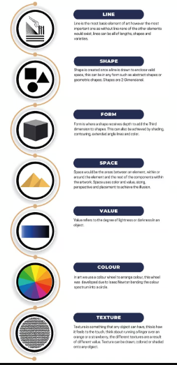
The fundamental elements of art form the building blocks that artists use to create visual expressions. Generally speaking, art consists of seven main components. Line, shape, color, form, texture, space, and value constitute these essential components. We will delve into each of these aspects in greater detail below.
Lines give artworks structure and direction, while shapes define the boundaries and contours. Color adds vibrancy and emotion, and form creates a sense of three-dimensionality. Texture engages the sense of touch, while space organizes the elements within the composition. Lastly, value, the range of light to dark, provides depth and contrast. Together, these elements harmonize to bring artistic visions to life and captivate the viewer's imagination.
Art elements find relevance across a broad spectrum of artworks, spanning paintings, drawings, designs, and various visual compositions. The importance of understanding these elements extends to both art students and enthusiasts. They serve as invaluable guidelines and tools, not just for composing an artwork but also for its analysis.
Moreover, as you plan the integration of these elements into your artwork, you can effectively direct the viewer's attention to your intended subject. Once a grasp of the art elements is attained, the possibilities for their application appear limitless.
Short Overview of Art Elements and their Characteristics
Color in Art is a rich tapestry encompassing the color wheel, various color schemes, primary, secondary, and tertiary colors. Additionally, concepts such as hues, tones, tints, shades, saturation, color intensity, value, color temperature, complementary colors, and analogous colors weave into this vibrant narrative. Value, the interplay of light and darkness in color, reveals itself through distinctions in low-key, high-key, and middle-key variations, adding depth and dimension to the visual experience. Lines in Art, ranging from horizontal, vertical, diagonal, short, long, curved, to zig-zag lines, form the bedrock of artistic construction. These lines are not just structural; they are dynamic contributors, imparting movement, rhythm, and emphasis to the artwork. Shapes in Art embrace a diversity of forms - square, circular, triangular, or rectangular - each two-dimensional entity possessing distinct geometric or organic qualities. Forms, extending into the three-dimensional realm, describe structures with width, height, and depth. From cubic, spherical, pyramidal, to conical, these forms can be either geometric or organic, adding sculptural depth to artistic creations. Texture in Art becomes the tactile language, representing the "surface quality" of artworks. Whether real or implied, texture adds a sensory layer to visual expressions. Space in Art expands the canvas into a three-dimensional realm, encompassing positive and negative space. This dynamic interplay offers artists a versatile playground to conjure various visual effects, shaping the overall spatial experience.
How do these elements collectively contribute to the overall impact of an artwork, and how can artists skillfully manipulate them to convey specific emotions or messages?
Art elements constitute foundational principles applicable across various artistic mediums, encompassing paintings, drawings, designs, and diverse visual compositions. Their relevance extends beyond art students to include enthusiasts, serving as essential guidelines and tools for both creating and analyzing artwork.
How do these elements contribute to shaping artistic expressions, and why is their understanding crucial for individuals passionate about art?
As you strategically incorporate these elements into your artistic endeavors, consider how they empower you to skillfully guide the viewer's attention. Can a nuanced understanding of art elements enhance the viewer's experience and interpretation of your work? The comprehension of these elements not only aids in creating art but also unleashes a world of seemingly boundless possibilities for their creative application.
Unveiling the Artistic Secrets: Principles in Focus
The principles of art are fundamental concepts that guide the organization and composition of visual artworks. These principles provide a framework for artists to create harmonious, balanced, and aesthetically pleasing compositions. The principles of art, alternatively recognized as the principles of design or organization, play an important role in structuring the application and utilization of art elements.
It is important to note that these principles are not strict rules but rather guidelines that artists can use flexibly to achieve their desired effects. Artists often combine and adapt these principles to suit their creative vision and the specific requirements of a particular artwork. Balance, contrast, emphasis, harmony, unity, proportion, rhythm, movement, variation, repetition or pattern, and scale are a few of these principles.
Why Understanding the Seven Elements of Art Matters?
A detailed understanding of color, value, line, shape, form, texture, and space provides artists with a broader creative palette. Mastery over these elements allows for more nuanced and intentional artistic decisions. Second, understanding the elements of art unlocks a realm of expressive possibilities. Artists can experiment with various combinations, techniques, and styles, expanding their artistic vocabulary and pushing the boundaries of creative expression. Moreover, artists can make informed decisions about color palettes, composition, and overall design by understanding how each element contributes to the overall aesthetic. This knowledge empowers artists to align their artistic intentions with the visual impact they wish to achieve. For those pursuing art education or a career in the arts, a detailed understanding of the elements is fundamental. It forms the basis for advanced studies, specialization, and professional development within the art world.
In essence, understanding the seven elements of art in detail elevates the artistic experience, fostering creativity, communication, and appreciation. Whether you are an artist seeking to refine your skills or an art enthusiast exploring the world of visual expressions, this knowledge enhances the depth and meaning found within the realm of art.
The Power of Color in Art
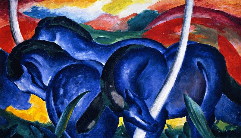
"Blue Horses" (1911) By Franz Marc
Color is a critical art element due to its ability to evoke emotions, convey messages, and create visual impact within an artwork. The thoughtful use of color significantly enhances the overall aesthetic and communicative qualities of a piece. Colors carry emotional associations, and artists can use them to evoke specific feelings or moods in the viewer. The visual hierarchy within an artwork can be established through color, guiding the viewer's attention to specific elements. Additionally, colors often carry cultural or symbolic meanings, providing artists with a tool to imbue their work with deeper significance. Finally, the color palette of an artwork contributes to the overall atmosphere and mood, creating a powerful means of personal expression for artists.
Examples of perfect color usage in the art world abound, showcasing the mastery of artists in manipulating color for expressive and aesthetic purposes. Vincent van Gogh's "Starry Night" uses swirling blues and yellows to create a dynamic and expressive night sky, conveying a sense of movement and emotion. Henri Matisse's "The Dance" employs bold, vibrant colors to capture the joy and energy of the dance, contributing to the overall celebratory atmosphere. Claude Monet's "Water Lilies" series showcases his mastery of color with subtle variations that create a tranquil and contemplative mood. Pablo Picasso's "Les Demoiselles d'Avignon" uses bold and contrasting colors to add avant-garde and confrontational elements, challenging traditional artistic norms. These examples illustrate how color, when skillfully employed, becomes a powerful tool for artists to communicate, express, and captivate the viewer.
Color Science: What Insights Does the Color Wheel Unveil?
Color science delves into the fascinating study of colors, exploring their origin, properties, and interactions. In the realm of art, understanding color goes beyond mere aesthetics; it involves grasping the science behind the hues that captivate our senses. When we talk about color, we encounter the concept of the color wheel, a fundamental tool that organizes colors in a circular format. It serves as a visual guide, showcasing the relationships between primary colors (red, blue, and yellow), secondary colors (green, orange, and purple), and tertiary colors, formed by mixing primary and secondary hues. Moreover, the color wheel aids in comprehending color harmonies. Analogous colors, positioned next to each other on the wheel, create serene and cohesive combinations, while complementary colors, located opposite each other, offer a striking contrast. These principles influence how artists blend and juxtapose colors to evoke specific emotions or achieve visual balance in their compositions.

Considering color as a science broadens our perspective, prompting questions such as: How do colors interact to create different shades and tones? How does the color wheel guide artists in selecting harmonious combinations? Delving into color science and the color wheel unravels the intricacies of color, shedding light on the scientific principles that artists and technologists alike leverage to bring a spectrum of hues to life.
Sir Isaac Newton is known with introducing the Color Wheel, a crucial instrument in art, in the seventeenth century. In order to highlight the connections between the hues, Newton arranged them in a circular pattern. This laid the groundwork for a methodical investigation of color theory that still has an impact on modern designers and painters. The Color Wheel operates based on the arrangement of colors in a circular format, systematically organizing them to illustrate their relationships and harmonies. At its core are the Primary Colors – red, blue, and yellow – the fundamental building blocks. Combining these primaries yields Secondary Colors – green, orange, and purple. Tertiary Colors further extend the spectrum, formed by mixing a primary color with a neighboring secondary color.
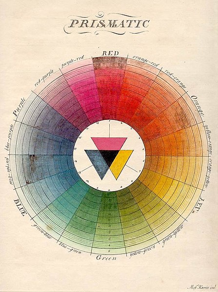
Moses Harris Book "The Natural System Of Colors" (1776)
This intuitive guide empowers artists to make informed choices, fostering balance and visual interest in their compositions. The color wheel, a timeless tool, continues to shape color theory and artistic expression.
Color Temperature in Art: How Does It Matter?
Questions arise when exploring temperature in color: How does the temperature of color contribute to the emotional impact of an artwork? How do artists strategically use warm and cool colors to create depth and mood? Temperature in color is a crucial aspect of color theory, contributing to the visual impact and emotional resonance of artworks. Colors are often described as warm or cool based on their perceived psychological associations rather than actual temperature. Warm colors, such as reds, oranges, and yellows, are associated with energy, warmth, and vibrancy. These hues tend to advance in space, creating a sense of proximity and intensity. Artists often use warm colors to evoke emotions like passion, excitement, or warmth in their compositions.
Cool colors, including blues, greens, and purples, are linked to calmness, serenity, and depth. These colors tend to recede in space, creating a sense of distance and tranquility. Artists leverage cool colors to evoke feelings of calm, introspection, or melancholy in their artworks.
The manipulation of temperature in color is a powerful tool for artists, allowing them to convey specific moods, establish visual hierarchies, and influence the viewer's perception of space. Consider, for instance, a sunset painting with warm hues of red and orange, creating a sense of warmth and intimacy. In contrast, a serene seascape dominated by cool blues and greens might evoke a calming and expansive atmosphere.
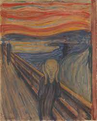
"The Scream" By Edvard Munch (1893)
Edvard Munch's "The Scream" (1893) is a masterpiece marked by the artist's bold use of warm, intense colors in the sky, set against cooler tones in the foreground. This intentional color scheme intensifies the emotional impact and unease conveyed in this iconic work.
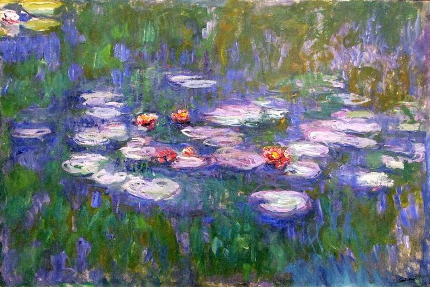
Claude Monet's "Water Lilies" Series (1897-1926)
Claude Monet's "Water Lilies" series (1897-1926) showcases a skillful manipulation of cool tones, predominantly blues and greens. The cool color palette imparts a tranquil and contemplative mood to these serene depictions of water lilies. These examples underscore the strategic deployment of color temperature by artists to convey specific emotions, establish visual interest, and set the overall mood and atmosphere of their artworks.
By understanding the interplay of temperature in color, artists can skillfully manipulate the emotional and visual dynamics of their creations, contributing to a more nuanced and expressive visual language.
Impact of Color Intensity and Saturation
Color intensity and saturation are essential elements in the realm of art, playing a pivotal role in determining the visual impact and vibrancy of an artwork. Understanding these concepts provides artists with tools to create dynamic compositions and evoke specific emotions.
Color intensity refers to the brightness or dullness of a color. Intense colors are vivid and vibrant, while less intense colors appear muted or subdued. Artists manipulate color intensity by adjusting the purity and concentration of pigments. Intense colors tend to draw attention and create a focal point within a composition, contributing to a sense of energy and dynamism. Saturation, closely related to color intensity, describes the purity or vividness of a color in relation to its brightness. Highly saturated colors are pure and vivid, while desaturated colors appear more muted or grayish. Saturation is a crucial aspect of color harmony, as artists can use variations in saturation to create visual interest and balance within their artworks.
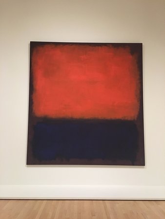
Mark Rothko's "No. 14" (1960)
Mark Rothko's "No. 14" (1960) is an exemplary showcase of abstract expressionism. The canvas is dominated by intense color intensity, as vibrant blocks of red and maroon demand attention. The high saturation of these colors not only creates a visually immersive experience but also infuses the artwork with emotional depth and resonance. Matisse's "The Dance" (1910) stands as a vibrant testament to Fauvism. Bold and highly saturated colors depict joyous dancers, contributing to the lively and celebratory atmosphere of the composition. Matisse's intentional use of an intense color palette amplifies the dynamism and energy of the dancers.
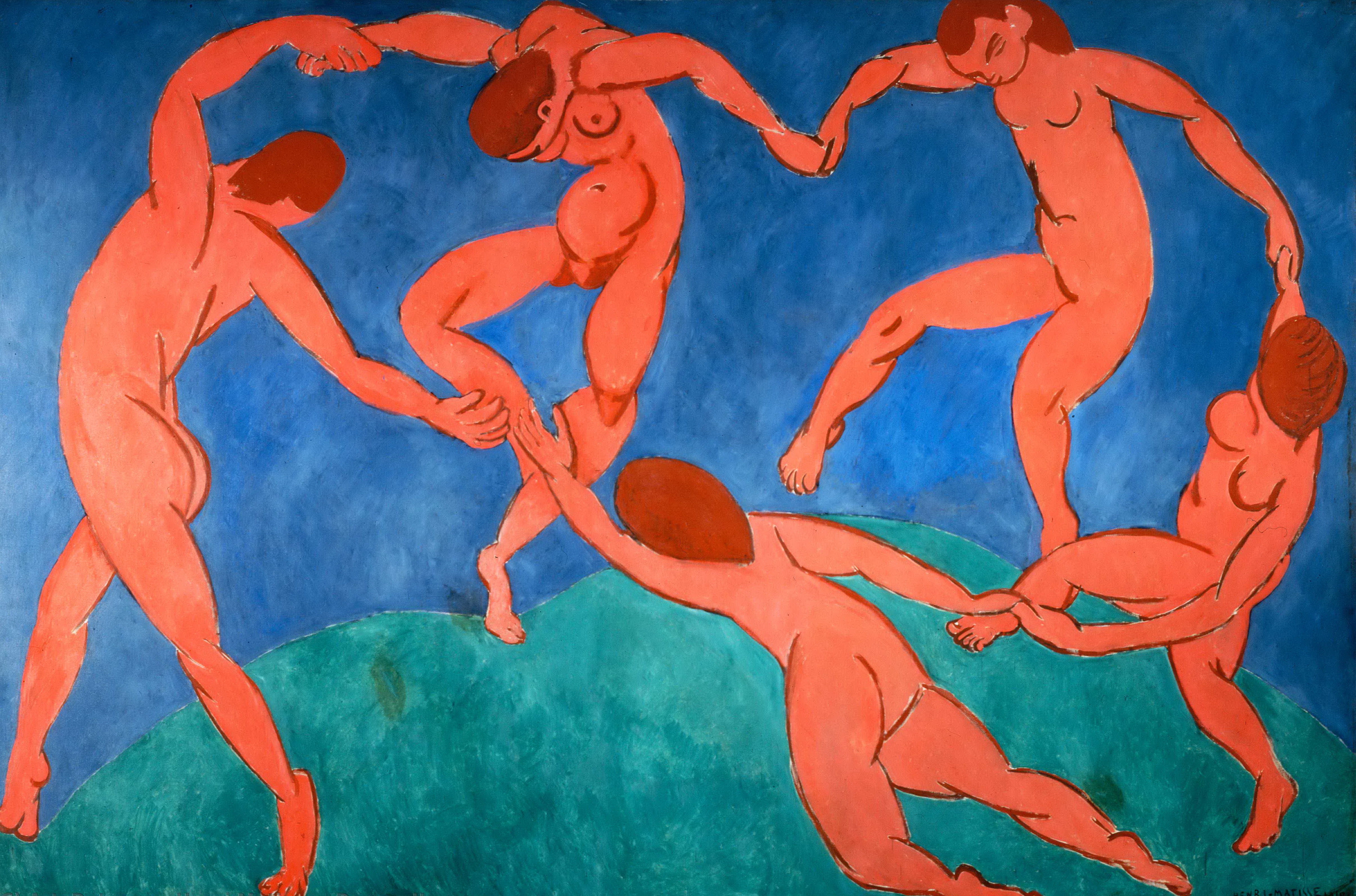
Henri Matisse "The Dance" (1910)
The interplay between color intensity and saturation prompts artists to ask questions such as: How does adjusting color intensity impact the overall mood of the artwork? In what ways can variations in saturation contribute to visual harmony or contrast? By exploring these questions, artists unlock the expressive potential of color, enhancing their ability to communicate and engage viewers through vibrant and nuanced visual experiences.
Significance of Value in Color Perception and Emotional Impact
Perception of color can also be significantly influenced by value, which is another significant aspect of art. Color's lightness or darkness is referred to as value. When black or white are added to a color, they are referred to as “shades” or “tints,” respectively, indicating the value of the addition. Looking at an image in black and white to reveal its grayscale values can often reveal the color value. Also, by emphasizing certain areas of an artwork, value can give it additional meanings or emotional impact. Moreover, value plays a crucial role in conveying different meanings and emotional effects in an artwork while adding emphasis. Colors represented in darker or lighter tones can evoke specific "moods" or suggest the time of day, highlighting aspects of the subject and creating a focal point in the composition.
What Role Does Texture Play?
Texture in art refers to the tactile quality or surface characteristics of an artwork, contributing to its visual and sensory experience. Artists use techniques and materials to create textures that add depth, interest, and emotional impact to their works. Texture engages both the eyes and other senses, enriching the viewer's interaction with the artwork. Texture in art extends beyond the visual, encompassing the tactile quality that adds depth and interest to compositions. Artists use various techniques and materials to create texture, contributing to a multi-sensory experience for the viewer. This surface quality not only enhances visual interest but also plays a crucial role in conveying emotions and setting the overall mood of an artwork.
In Rembrandt's "Self-Portrait with Two Circles," the use of impasto, with paint applied thickly, adds a tactile quality that enriches the depth of the self-portrait. Again, Claude Monet's "Water Lilies" series showcases delicate brushstrokes capturing the texture of water surfaces and floating lilies, enhancing the serene atmosphere. Jackson Pollock's unconventional drip painting technique introduces a unique texture in works like "Autumn Rhythm," reflecting the spontaneity and energy of his artistic process. Also Andrew Wyeth's "Christina's World" demonstrates meticulous rendering of grass and ground, imparting a subtle texture that grounds the viewer in the rural landscape and emphasizes emotional depth.
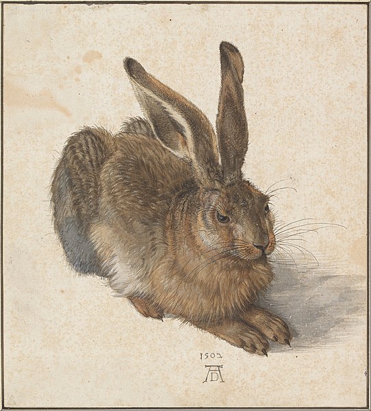
"Young Hare" (1502) by Albrecht Dürer
Thus, Texture in art becomes a tool for artists to convey energy, movement, or stillness, amplifying the expressive potential of their work. Through texture, artists not only engage the eyes but also invite the hands to explore the nuances of their creations, adding a layer of sensory richness to the viewing experience.
What About Shape?
In art, shapes are fundamental elements that contribute to the composition of an artwork. Geometric shapes are precise and regular, often associated with mathematical principles. Examples include circles, squares, triangles, and rectangles. These shapes convey a sense of order, structure, and stability in artworks. Organic shapes are irregular and free-form, resembling the shapes found in nature. They lack the strict, defined edges of geometric shapes and often convey a sense of fluidity, movement, and spontaneity. Examples include leaves, clouds, or the contours of a rock. Artists strategically use these primary types of shapes to convey different emotions, establish visual balance, and communicate their artistic intent within a composition. The interplay between geometric and organic shapes contributes to the overall dynamic and aesthetic appeal of the artwork.
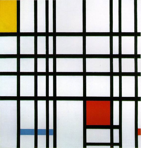
"Composition With Yellow, Blue And Red" (1937–1942) By Piet Mondrian
Prominent instances of geometric shapes in art can be found in works by renowned abstract artists like Piet Mondrian and Kazimir Malevich. In Mondrian's "Composition with Yellow, Blue, and Red" (1937–1942), squares and rectangles emerge through the strategic arrangement of thick black lines on the canvas. Similarly, Malevich's "Black Square" (1915) underscores the importance of basic geometric shapes in abstract art, marking a crucial moment in the recognition of such simplicity in artistic expression.
The Understanding of Form in Art
Form, as an art element, pertains to three-dimensional structures. Various forms exist, encompassing shapes such as spherical, cubic, pyramidal, conical, cylindrical, and numerous others. The comprehension of form in art involves skillfully portraying three-dimensional attributes on a two-dimensional canvas, encapsulating an object's volume, depth, and structure. Various techniques, including shading, perspective, and chiaroscuro, are employed to create the illusion of form and infuse vitality into artistic creations.
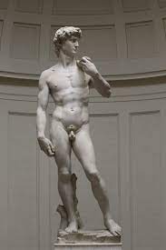
Across different art movements and periods, artists have demonstrated their prowess in manipulating form. Michelangelo's "David" stands as a testament to his ability to capture the human form with intricate detailing and a profound sense of three-dimensionality. Caravaggio's "The Calling of Saint Matthew" showcases how chiaroscuro can be harnessed to emphasize the physicality of figures and heighten the sense of form.
In the realm of modern sculpture, Barbara Hepworth's "Pelagos" reflects a contemporary exploration of form, leveraging negative spaces within pierced forms to contribute to the overall sculptural composition. These diverse examples underscore the versatility and significance of understanding form in art, transcending the constraints of a flat canvas.
The Artistry Behind Lines
Lines are essential components in the field of art that go beyond simple demarcation. They have the ability to define the composition as a whole, direct the viewer's gaze, and elicit strong feelings. Different types of lines each add something special to the visual story.
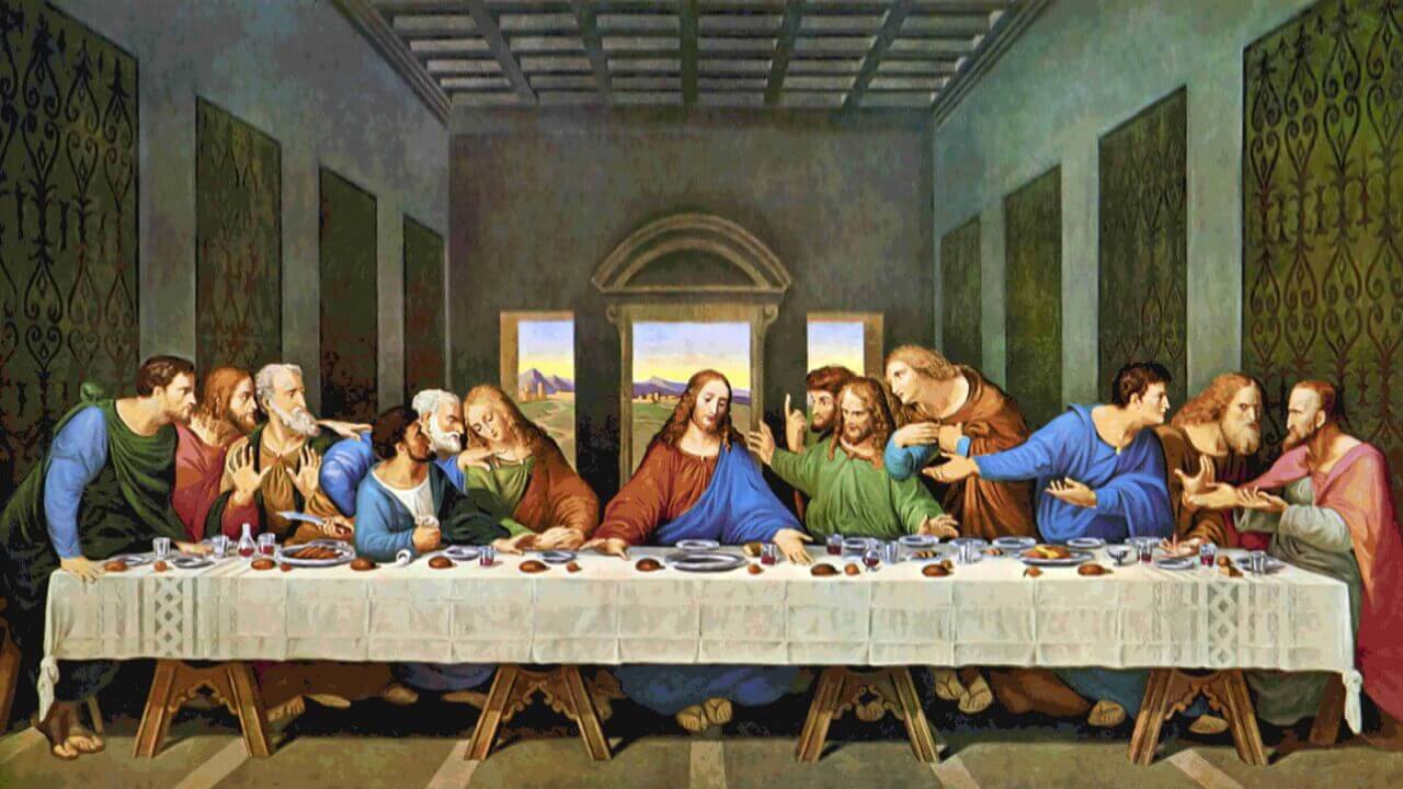
Leonardo Da Vinci's "The Last Supper" (C. 1495–1498)
Consider the finesse in Leonardo da Vinci's masterpiece, "The Last Supper" (c. 1495–1498). In this iconic painting, the subtle use of lines skillfully outlines the contours of figures, creating a sense of depth and perspective. The diagonal lines of the tablecloth lead the viewer's gaze toward the central figure, intensifying the emotional impact of the scene.
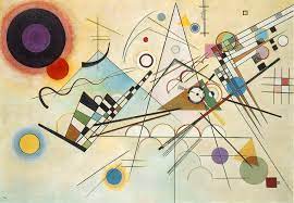
Wassily Kandinsky's "Composition Viii" (1923)
Moving to a more contemporary example, Wassily Kandinsky's "Composition VIII" (1923) showcases the dynamic potential of lines in abstract art. Kandinsky employs bold, intersecting lines that not only define shapes but also evoke a sense of movement and rhythm, adding an expressive dimension to the composition.
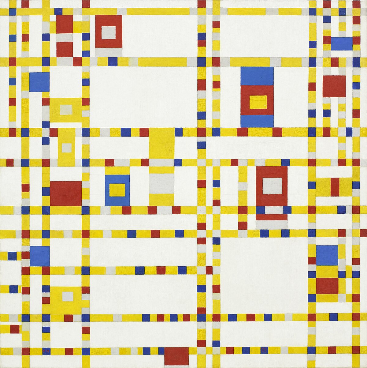
Piet Mondrian's "Broadway Boogie Woogie" (1942-43)
In contrast, Piet Mondrian's "Broadway Boogie Woogie" (1942-43) demonstrates the power of grid-like lines. The rhythmic arrangement of colored lines suggests the vibrancy of a cityscape and reflects the artist's exploration of harmony through geometric abstraction.
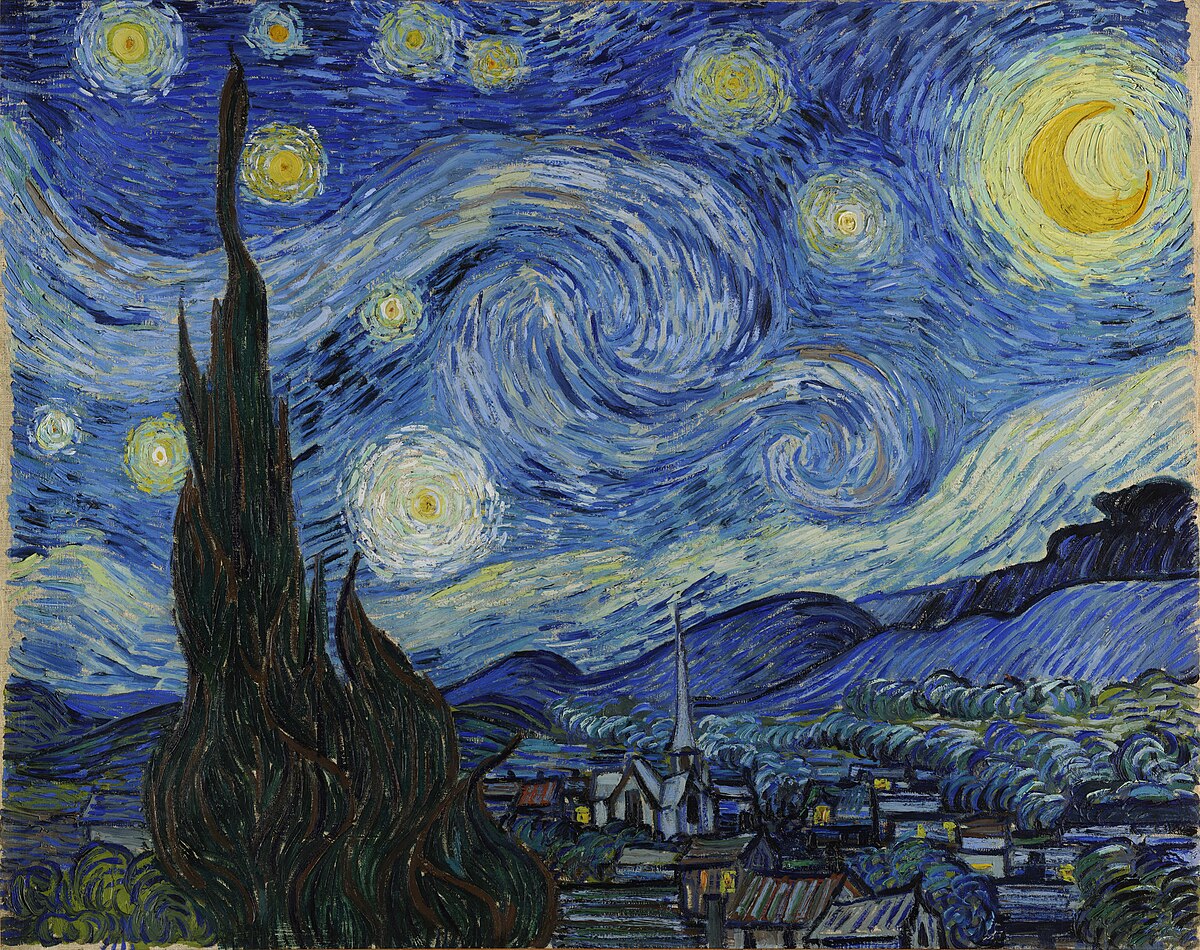
Vincent Van Gogh's "Starry Night" (1889)
The bold and expressive use of lines is further exemplified in Vincent van Gogh's "Starry Night" (1889). Van Gogh's swirling, undulating lines in the night sky evoke a sense of turbulence and energy, contributing to the emotional intensity of the piece.
These examples illustrate the diverse ways in which lines are employed in art, transcending their functional role as mere outlines. Instead, lines become dynamic tools that artists wield to shape narratives, evoke emotions, and invite viewers into a world where the magic of lines unfolds on canvas.
Can Space Transform the Essence of Art?
In art, space encompasses the illusion of depth and distance within a composition. It goes beyond the physical boundaries of the canvas, creating a visual playground for artists. By skillfully manipulating space, artists can alter the perceived relationships between objects, guide the viewer's gaze, and infuse a painting with a distinct mood. Space acts as a transformative element, turning a flat surface into a multidimensional experience, enriching the narrative, and inviting viewers to explore the layers within the artwork.
Illustrating this concept is Francisco Goya's Black Painting series, notably "The Dog" (c. 1819–1823), where a vast expanse of space dominates the composition, emphasizing the solitary figure of a dog below. This strategic use of space not only amplifies the visual impact but also directs our focus to the lower portion of the artwork.
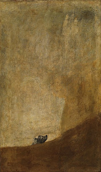
Francisco Goya's "The Dog" (C. 1819–1823)
Techniques employed to impart depth on a two-dimensional surface encompass linear and atmospheric perspectives. Linear perspective, as seen in Leonardo da Vinci's "The Last Supper" (c. 1495–1498), utilizes parallel lines converging to a single focal point, creating the illusion of space. In contrast, atmospheric perspective relies on color and value to introduce a subtle haziness, particularly effective in portraying distant elements within a composition.
By judiciously applying these spatial techniques alongside other art elements like line, color, and value, artists ensure their creations carry a compelling visual resonance. This deliberate manipulation of space not only enhances the overall impact but also shapes the viewer's engagement with the artwork.
Keeping these seven art elements in your artistic toolkit is a surefire way to elevate your creative endeavors. Every artwork holds layers beyond initial observation, and delving into the strategic use of art elements enhances not only your artistic prowess but also sharpens your analytical skills.
No Comments Yet...